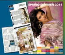
Stahl reveal colour forecasts for spring/summer 2011
2 December 2009Stahl’s new Design Studio consultants, Bianco and White, have used their first presentation of a fashion colour forecast to provide Stahl with a new way of looking at colour. The ever-popular poster, is now supported by a new-look colour preview book. The number of colour groups has been reduced to four.
This has allowed an improved selection of colours to be included, along with simple text explanations outlining mood, inspiration and colours and a radical re-think on the presentation of illustrations make the whole presentation much easier to understand.
The four colour groups selected for Spring-Summer 2011 are ‘Tramp’, ‘Smooth’, ‘Tonic’ and ‘Spotless’, each containing eight basic colours that are expected to lie at the heart of the colour spectrum for the season.
The first colour group, Tramp, is based on a mood of authentic quality and rediscovering the rhythms of rural culture. Inspiration is derived from a mix of ‘beach mood’ and night glam’ whilst integrating something of the ‘gypsy’ into the city and rural styles. Colours are strong and natural, reflecting roots in distant ethnicities and museum vintage in pastel shades and in summery shades of blue, orange, purple and green. The illustrations show how scintillating, dramatic, brilliant effects are achieved as these colours are combined in patterns that cannot fail to catch the eye.
As its name implies, the second group, Smooth, is less dramatic, keeping a mood of simplicity and health. Here are moods derived from mother earth inspired by respect for the universe and a vegetable world derived from respect for the environment with its continual reminder for us to recycle. Colours are organic with earthy gradations that eventually reach over the horizon to the deep blue abyss beyond.
From a world of gentle, earthy colours, the Tonic group plunges into a world inspired by energy and vitality. Vivacious clashes of brilliant bright colour are accented still further by naïve graphics. The mood is derived from the United States with an emphasis on eco-sustainability. The result is continual dramatic contrast of colours, white and brown, yellow and red, green and purple, blue and orange. This is a riot of colour and effect.
Finally, everything calms down entering the Spotless colour group. There are no decorative excesses, only an essential elegance leading to a mood of candid and less sumptuous purity. The inspiration is one of a calm and still atmosphere that relaxes and purifies body and mind. Soft tonal shades suggest neutrals that are quiet and hidden from the light of the sun. No brilliant colours, this is a range of gentle colours that offer the opportunity for use in many unusual combinations that give a feel of peace and gentleness.
Stahl’s Colour Preview for Spring-Summer 2011 really is something new. It is eye-catching and is easy to understand. Above all, the simplicity of its presentation encourages the thought that ‘Here is something we can use in producing our own range of colours for Spring-Summer 2011.’